ToF 3D Devlog #2: Pixels re-imagined
29/10/2020

Oh boy, it is already over a month since I made the first devlog. Time flies. Thankfully, I have quite a lot to show for it! Making semi-regular gamedev sessions and delegating one streaming day for creative streams really helped. I highly advise trying that, if you are having trouble keeping your schedule on your own.
So much have changed, that I actually can't recall all of it. I think making notes after each session might actually be a better option. I am making screenshots regularly, but forget some details. Oh, well.
(All images here can be found in original resolution on Github)
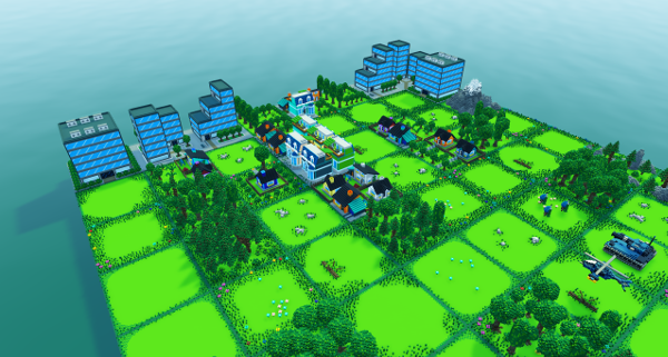
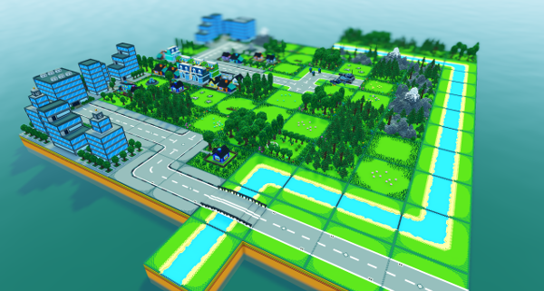
Goal for this part was to re-make most of the remaining ToF1 assets into voxels. Last time we ended on some smaller buildings, so the next logical step was to create big ones! Skyscrapers and offices are a bit blocky, but look consistently with old game, and each other.
Every town and every city needs streets, so I worked on roads, with additional sidewalks. Now we can have both streets and country roads.
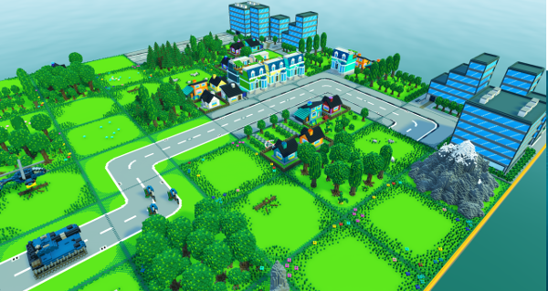
Added a T-junction and a crossroad, so now I can create any type of road I need. And all come with sidewalked versions. Neat.
Added one more model of a skyscraper, which I created before, but forgot to add to the prototype map. After that, created a straight and "turn" river tiles. A small bridge can now be placed as well, so the road can cross a river.
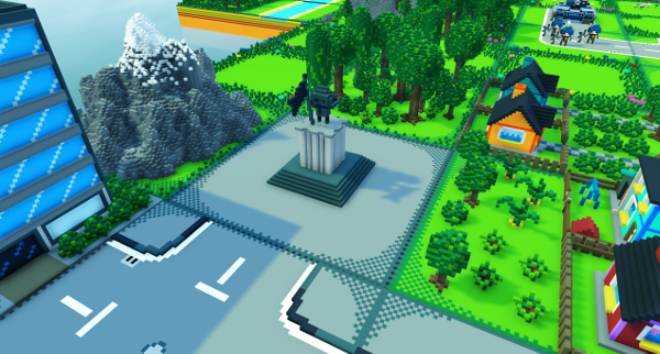
A small touch from ToF1, which is a statue of a character holding a flag. Useful for plazas. I have also created a fountain, which can be used for a park area, but I didn't make a screenshot for some reason.
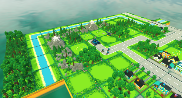
Rivers and roads were a bit plain, so I have added new grass framing, that goes around them. Makes these tiles look less same-y.
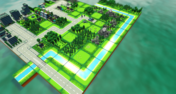
I didn't like how a river was just a flat, blue stretch. I decided to cut them out of tiles and place separately, so I could add reflective material to them. This also applies to the windows on big buildings, though it is not really visible with the camera angles I chose for this prototype.
Next thing on the list: base buildings. The original ones were kind of blocky and simplistic, but I think I re-made them pretty well. The headquarters bunker now has more of a Pentagon office vibe, but it's square. Barracks have a weapons rack and shooting range, though they are so small it's hard to spot. Armored vehicles factory is just a block, not much to work with there, but I managed to add a bit of detail, and made it look like a big hall made of sheets of metal. Or, at least, that was the intention there.
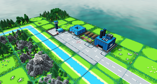
The airfield is quite similar to the old one, but it has a small hangar instead of a terminal building. I felt like it made more sense for a military object. Also, each building now has a fence with a gate, which is used instead of a grass frame for a tile.
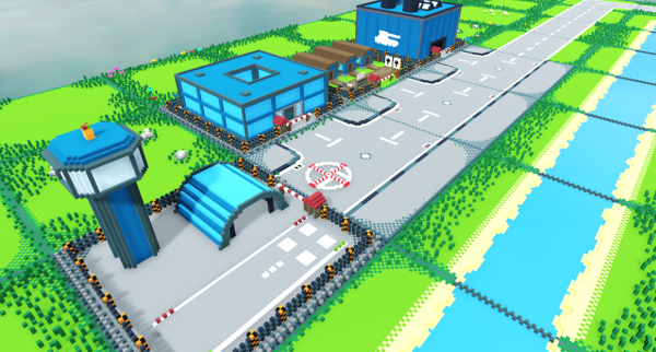
Some top-down shot just to see how it looks like in the more AW-style camera.
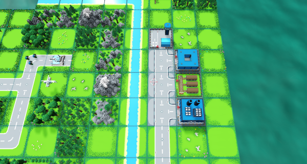
Final building for this round is a GSM tower. These were used as a source of action points - the primary resource in the game.
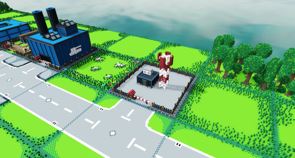
The previous tower was a bit too short, so I made it taller, looks pretty good. Added muddy roads for forests and such, which connect with the paved ones. There used to be a designated tile joining them, I might re-make it in the future. For now, this works fine. There is also a tiny, new unit...
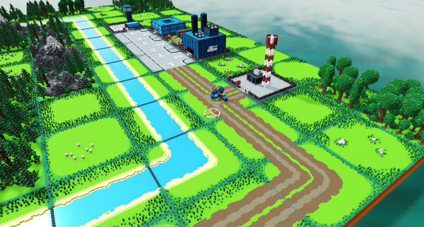
...which turns out to be two soldiers on a motorcycle! It's mobile infantry unit, meant for scouting and support roles.
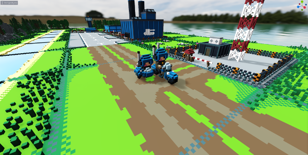
But that's not all. There is also a scout helicopter.
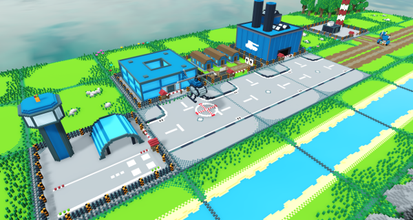
This one is more civilian-like, being a bit smaller, and with lighter construction. But it still has a gun, and can bite!
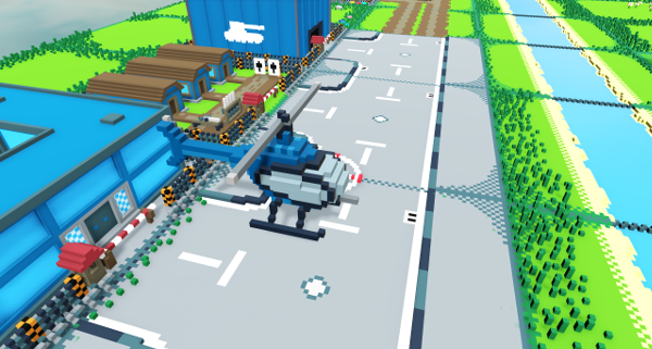
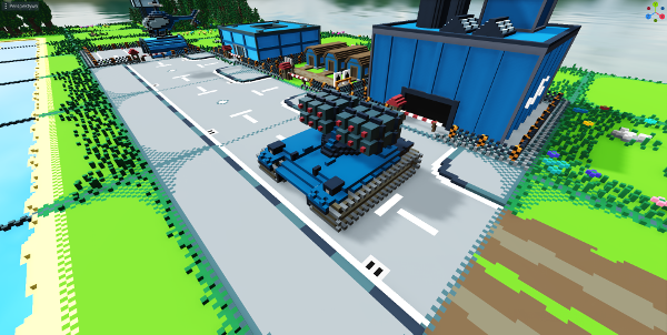
Here we see a mobile rocket artillery unit, freshly rolled out from a factory behind it. Another new unit, that is meant to be sort of an expensive glass-cannon, that offers high risk and high reward for using it efficiently.
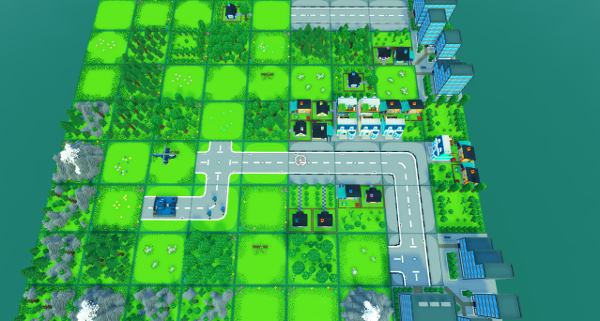
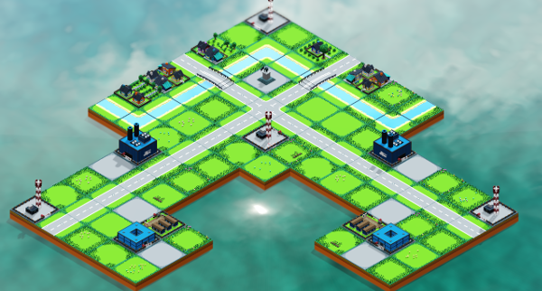
With most of the assets being done to their initial stage, I decided to re-make a map from ToF1, just to be able to judge where I am with the re-make. As I was playing with the camera settings, I have switched it to orthogonal mode and got this interesting view, which resembles original game quite a lot! It has it's issues, and I would have to re-do the camera to fit this setting better, but it is very promising.
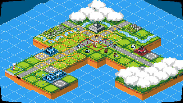
For comparison, here is how this same map looks in the ToF1. A lot of the detail is still missing, but I like the parity so far.
Just for comparison, here is the same map, but with the same camera, as all previous screenshots.
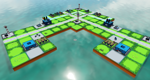
I'm thinking about implementing a couple of different camera modes to be available to the player, so they can choose their own style. It might proove to be a bit of a challange in the future, but It will be worth it.
Next time, I will be implementing some actual functionalities. Currently, I'm still deciding if I want to make some map editor, so I can create maps to create gameplay on, or start working on gameplay first.


