ToF 3D Devlog #3: Building an editor
21/11/2020

Another month, another devlog coming up. Last time, we have ended up with a choice what to implement first. I went with the Editor, so I can create maps for gameplay. My idea of making notes while I work didn't really happen, as I forgot about it as soon as I closed editor with previous post. It has to wait until I level up my blogging skills.
(All images here can be found in original resolution on Github)
I really liked the idea of different camera modes, so I went with it. I have experimented a bit with different angles and sizes for the orthographic one, to make it look like the first game. There are three: ToF style, Advance Wars style, and free camera style. Although, after looking at screenshots I gathered, it seems I never use the AW style. Need to remember to show it off next time!
This one here shows one of the camera angles, though I did not like it, since it squished the map too much. After camera angles has been selected, I implemented camera switch button, and added zoom function to all of them.
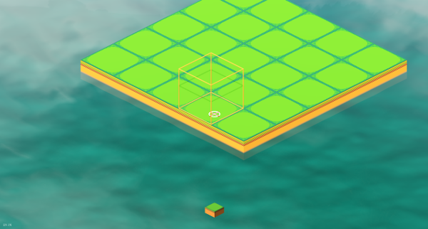
With that out of the way, I could finally start making the editor. Making all necessary scripts and data structures took a bit, but once I was done, I added basic grass ground tile to see how it worked.
I have also worked out how to use 3D elements as parts of 2D user interface. This is great, as I don't have to prepare any icons for them - I can use models directly in UI!
You may also notice, that there is a box selector now, which shows tile being edited.
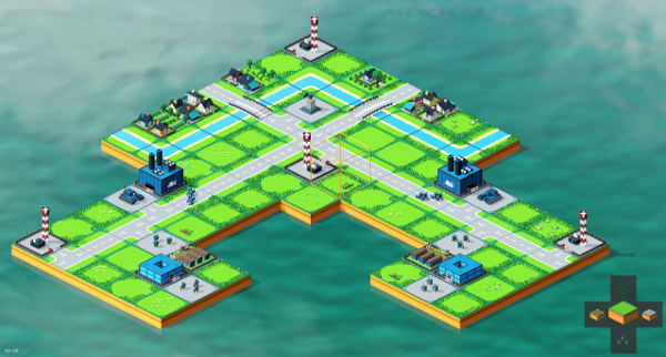
I kept working on the UI and created the D-pad tile selector, which allows me to cycle through tiles and choose which one to use. Tiles are separated into groups, such us ground, nature, city, buildings, units, etc.
Each tile is being placed on a proper layer depending on its type, and some types overwrite each other, so you can't have a forest and a scyscraper on the same tile.
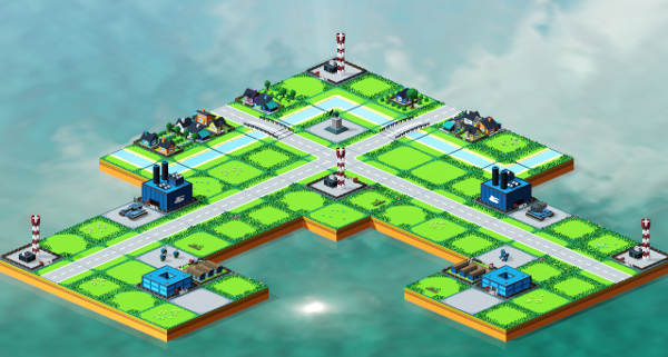
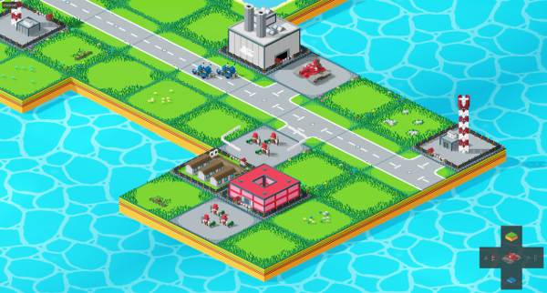
Equipped with this new tool, I have recreated Crossroad map. Again. Hopefully this will be the last time.
Editors are usually quite complicated things, with many bells and whistles. In order to accomodate them, I need a menu system. Old ToF had to account for touchscreen users, which meant, that many functions needed explicit gadget to be on the screen, and to be big enough to tap it reliably. It was also a mess of popups. I didn't really liked it, and I wanted to make something different here.
Since the game is focusing it's controls on using a gamepad, I decided on a radial menu - many console games use it with great success, and players should be fairly famirial with them. Just tilt an analog stick and press a button!
I have built a generic menu with 8 fields, that can be re-used in many places, and should also be possible to preapre multi-layered menus with it. I had to come up with some icons for it (not in this screenshot though).
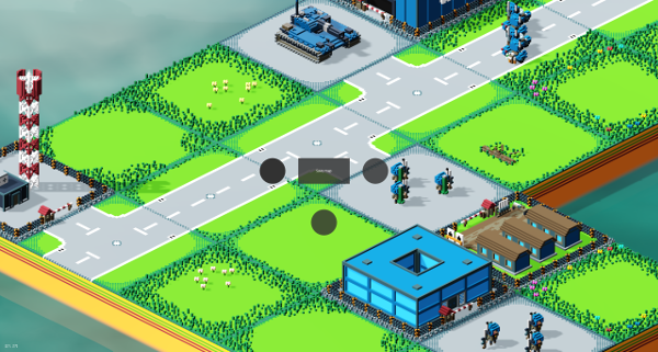
Up until this time I have used an asset-library water shader for the background water. I didn't like how it differed in style from the other assets though. I needed something more fitting. Luckily, I have found a simple tutorial about making your own water shader in Godot by Bastiaan Olij. I highly recommend his videos on YouTube!
New water was created by following his instructions closely, though it does not implement everything. I did not need transparency, nor refraction, so I skipped these. I have used the water texture from his tutorial, though I have re-coloured it a bit to fit my pallete better.
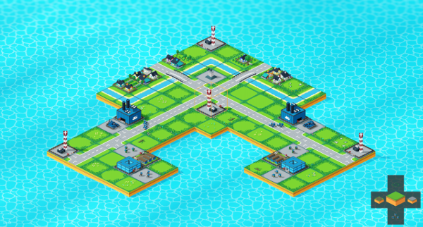
I haven't mentioned it before, but at this point my Editor already has a save and load capabilities! Map can be serialised into a JSON file, and re-created from one as well. The editor actually already does autosave the map with every change, and loads it back when it's scene is started.
Now I needed some interface to explicitly use these save and load functions. I came up with a simple menu, composed mostly of semi-transparent rectangles and a couple of buttons. It does look decent though, so I think I will go with this style of menus for now.
The menu I prepared has a list of saved maps, and widgets to save/load one by name.
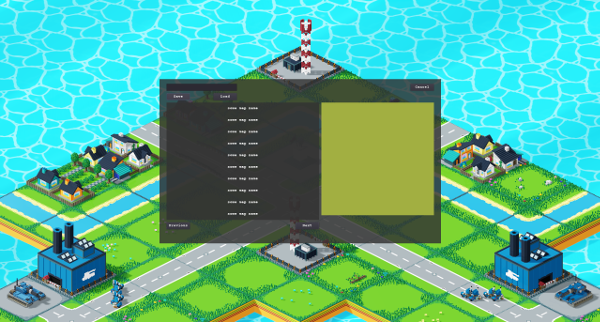
Next part required a bit of coding, and less node editing. I have created some map file management, and connected it with the menu, so now it loads a list of known maps. These can be selected, which autofills the name field for save/load actions.
There was also some work needed to manage menu and editor inputs. It actually started to resemble the popup mess from the old game, but I think I have it under control now.
Map selection required a bit of flare, so I added a minimap, that shows currently selected map. It also helps with recognizing maps at a glance.
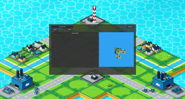
These were all the funcionalities I needed in an editor so far. In the meantime I have added an option menu, that wipes the editor clean, so I can start working fresh on a different map.
So, the editor is done for now, and I can start working on gameplay! Or so I thought. Becasue, for gameplay, I kind of need two sides of the conflict, but I only have one. I could just use same assets for both, and re-colour them later, as we did in ToF, but where would be fun in that.
I decided to start working on units for the red side. But simply changing colours of the blue ones would be a lazy approach. I have planned for the red team to have a bit of a steampunk vibe, so all-new set of assets was in order.
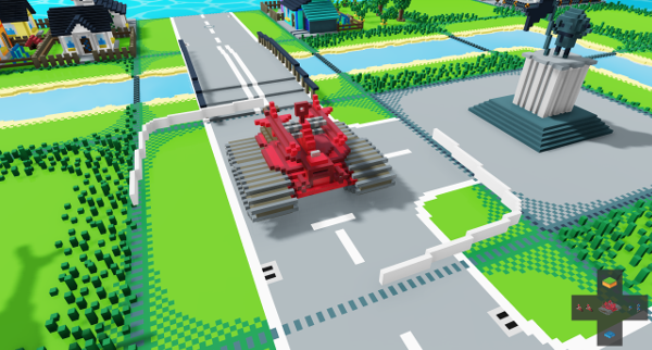
I have started with units. First one was an Infantry squad in top hats! And some low-tech tank to acompany them. They use simple rifles. The only thing I don't like them is that I lacked an idea for an armour-piercing weapon for them. So they have a rocket on a stand. It looks a bit weird, and I have to change it, but I left it for now.
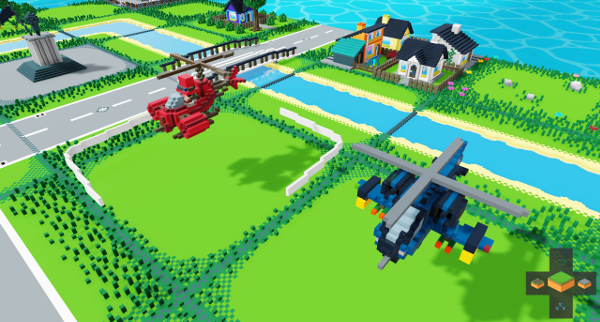
Next one was an attack helicopter. This was actually the most difficult for me to figure out, as steampunk doesn't really do all that many helicopters. And they usually have a ton of tiny details, which are hard to translate into low-res voxels. In the end, I have based this one on a World of Warcraft goblin airplane, which is a bit steampunk-y. I tried to not make it too obvious though. And this one has a visible pilot.
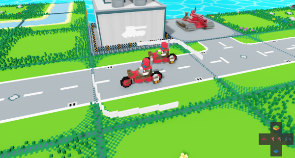
Mobile infantry is next. I have found some real, steam-powered motorcycle in Google images. An incredible build, for sure. I have based my infantry on this one, and it came out really great! It is different from the modern blue style in that it does not have a side-car with a passenger.
Rocket artillery was created in a similar way to the blue one - I have removed a turret from a tank, and placed some rockets on top of it. This one I'm the least happy about, as these rockets blend with the main hull of the tank in most of the camera angles. I'm pretty sure this one will be revised in the future.
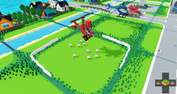
Scout helicopter is another one with a visible pilot. It is based on another googled image of a small helicopter. It's more lika a seat strapped to a motor, with a pair of wheels. I like it.
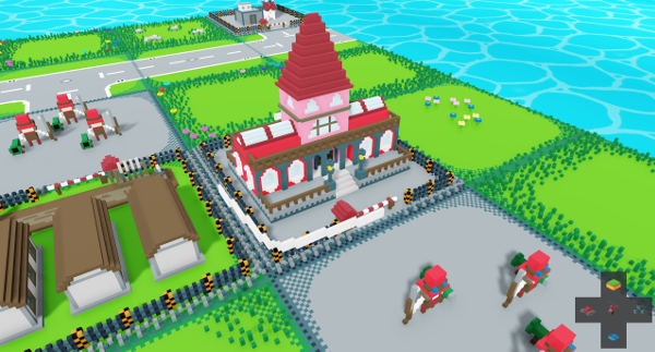
Now, our new steampunk friends need some buildings of their own. Headquarters are first. For this one, I decided to do it town hall style. These new buildings alos have another feature: they change colours! Since these buildings will be capture-able, I had to figure out how is that going to affect it. I could change the whole building style, or just swap colours. Swapping seemed like more interesting, and more flexible option. Without it, modern style would always be locked to blue, and steampunk to red, and it didn't seem right.
I have added all four colours - buildings can be green and yellow as well, though screens only show them in their canonical colours.
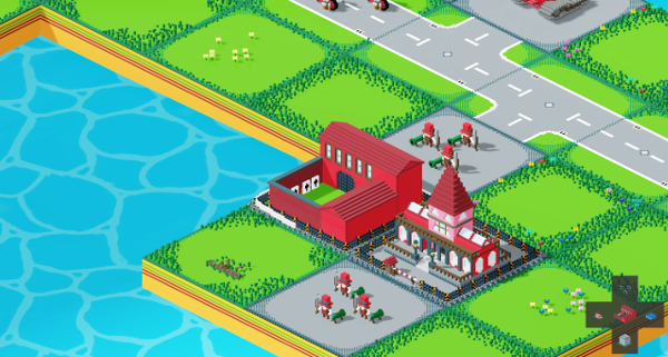
I didn't really have an idea for Barracks, so I went with this 19th century, military building, that is made of bricks. A two-stories front, with a side-build and a courtyard for training. A bit simplistic, as it lacks detail on the walls, but I like it.
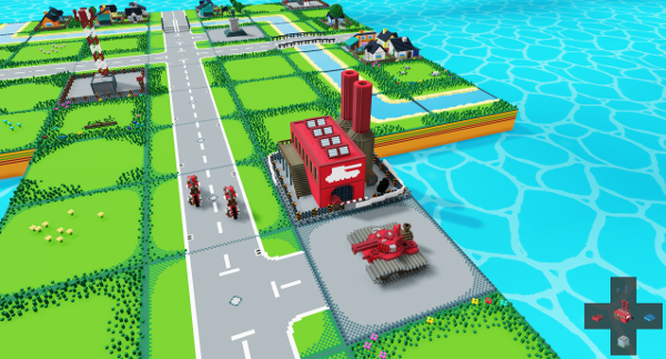
Many steampunk designs include huge cogs, furnaces, chimneys and other, similar stuff. I can't really do cogs easily in voxels, so, for the Factory, I went with furnace and some chimneys. It is meant to resemble an industrial-age factory building, with a catwalk on the side. It also sports a pile of coal, and it can churn out tanks all day long.
Steampunk airfield is a bit difficult. As I said before, there aren't all that many helis in this style. There are planty of airships, but these use very large structures as airports. I decided to make it look like a low-tech airfield, with a simple hangar, a runaway, and a cargo depot.
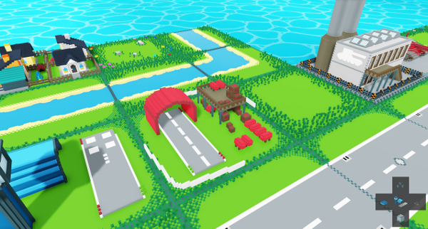
Tower design was supposed to resemble a water-tower, but I think the shed underneath is way too big, and the water tank is way too small. This one needs a revision, but it will work for now.
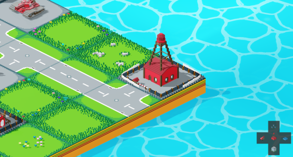
Since buildings can be coloured to be any side, units should be as well. I think I will actually make it so buildings will only produce matching-style units. When you take over some of the enemies factories, you will have a mixed-style forces. There is a small difference when compared to buildings though, as a building can be in neutral, grey colours, but a unit can not. On the second though, I could change that, as neutral units, that join whichever side reaches them first is an interesting idea.
Here is an example of both modern and steampunk Infantry units in all available colors.
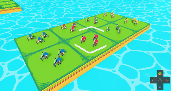
And here we have with all of the red side assets swapped to the new style. It adds some differentiation, a good change from the old, mirrored map.
I have re-used the minimap from the save/load menu, to make it easier to work on big projects, as it's easy to get lost.
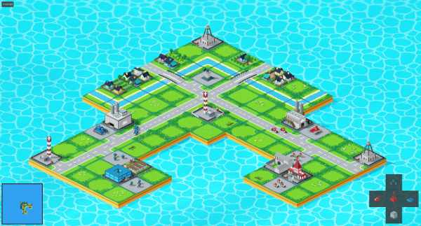
And now I truly am ready to start working on gameplay. I actually did already! But I'm saving this part for another devlog. It's christmas next month, so development might get a bit slow. See you next time!
