ToF 3D Devlog #4: So much progress
21/6/2021

It's been 54 years since last devlog...
Well, maybe not that long, but still. A lot of things happened in the meantime, but the biggest reason for the delay was that my server literally burnt down. Luckily, after about 2 months OVH was able to restore my VPS (even though they were not obligated to!). Also, I was deep in script development for ToF, so there wasn't much to show off.
Last time I have ended on a note, that I was ready to create some gameplay. And gameplay we did! There is so much progress, that I might have forgotten about some details in the meantime. But that is all good!
(All images here can be found in original resolution on Github)
First thing to do was to create a game board, that re-uses the same map, as editor, but is a completely separate thing, to avoid mixing editor code with game code. Thanks to the map code, we already can load a map from file. Here we can see new additions to the selector: it changes colour according to the current player side, and we have complementary part, that indicates an selected tile.
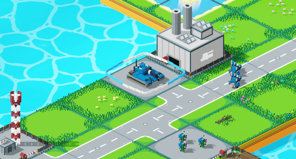
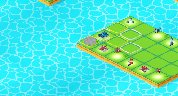
Most basic action, that we can do, is to select and move units around. For this purpose I have implemented Depth-First Search algorithm, that aims to find all of the reachable tiles, within a set range. Those tiles are marked with a frame. Frames also get coloured for context. Unit can move to a green field and still retain counter-attack. White fields use up all of the unit action points and no further actions are possible. Blue fields indicate possibility to claim a building, while red are for battles!
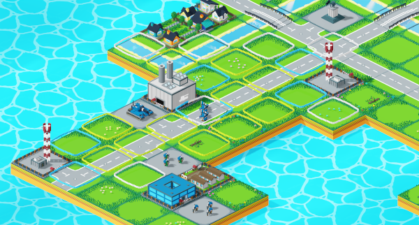
When standing next to an enemy, and unit has enough action points and attacks available, a rotating, red indicator is shown. ToF 1 had a crosshair, which can't be easily replicated here, but this one is intended to be similar.
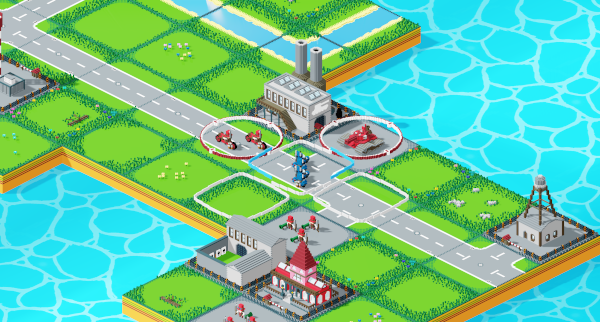
I tried to figure out how to do the green arrow indicator for claiming buildings, but I decided it would be difficult to have it look right, as it would, most likely, clip with buildings. So I re-used the attack one instead, by simply turning it blue.
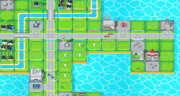
Something, that older game lacked, was visualisation of a path, that unit is going to take. So I added it. The DFS search now additionally builds shortest path to every tile it discovers, and keeps them in temporary cache. This helps a lot, as I don't have to perform path search every time a player highlights a tile.
Also, on this screenshot, we can see an AW camera for the first time!
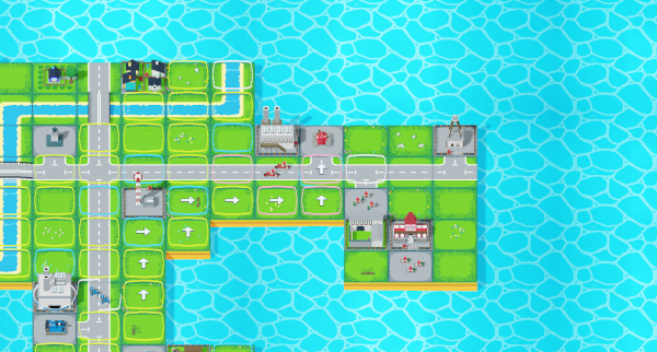
A bit of code, and now arrows point correctly to the next tile in a path.
Another new feature is that now units actually move between tiles instead of just teleporting to their destination. This was possible thanks to the path we previously plotted. Additionally, this shows a difference from old ToF: units can now pass through other allied units. This makes it more in line with how AW works, and also makes movement more intuitive.
If we can move towards the enemy, then we can fight! This next video shows already finished battles, with a bit of smoke particles and counter-attacking. Units are not balanced yet, but will be at the end of this part of devlog.
Here we can see a still image of the puff of smoke, that happens, when unit is destroyed.
After some coding work I have added other missing gameplay loop mechanics: claiming buildings, gaining resources and building new units. It is also possible to win by claiming enemy HQ. The game is fully playable!
One of the goals of new version of ToF is to have more players. Technically there can be as many players in the match, as many GDScript can fit objects in an array, but I have only prepared four colours and styles, so I think this might be a limit for now.
To show this off, I have taken the classic Crossroad map and expanded it to now sport four sides!
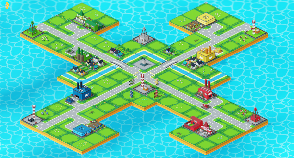
Having four players is nice, but the game needs to be also available for solo play. The AI implementation took some time, and I did not produce almost any devlog artefacts during that work. Instead, I just hunkered down and got to it. Here we can see final results in action.
We can play the game, but the map, and list of players, is currently hardcoded into the game board itself, and this simply will not do. It is time to create simple menu for the game, that will allow us to set up games, and also go into editor.
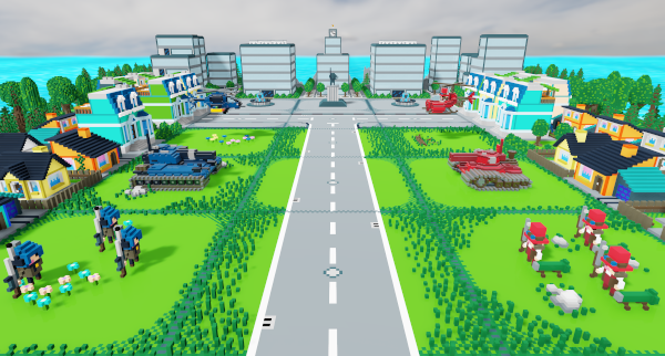
Here we have a map, that will serve as the background for the menu.
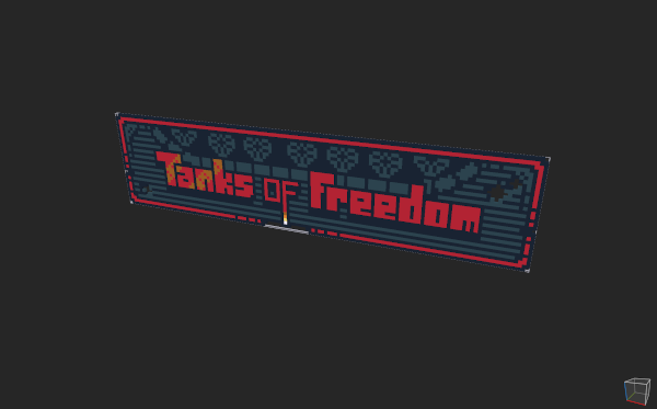
The original logo has been re-created in voxels as well, so that I can use it in 3D space instead of having it just as an overlay.
Using these assets I have built a simple menu. It allows for a Skirmish battle, and provides access to the Editor. Campaign and Settings options are also included, but disabled, and they do not do anything.
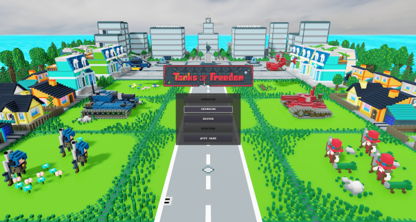
I really liked the cinematic bars for AI turn, they help to visually indicate, that user input is not required at this time.
Next step was to start building out scripting for campaign. The goal was to present player with characters, dialogs, move elements of the map, etc. Here we have a simple dialog window, that can show any text and can be dismissed.
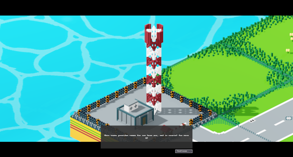
Building out scripting capabilities took significant amount of time and procastrination. Again, as with AI, it was mostly code work, with little to no assets required, so I did not produce any images for this. It did, however, have visible results on a moving board, so I have prepared a short clip presenting most of the tools, that can be used for cutscene creation.
Since that clip I have improved camera movements and zoom, but was too lazy to re-record.
After that big chunk of work I got tired of coding for a bit, so I decided to switch to assets. Unique styles for green and yellow players were still needed, so I went with that.
Green nation theme is Futuristic. Their vehicles hover, and are equipped with high-tech railguns.
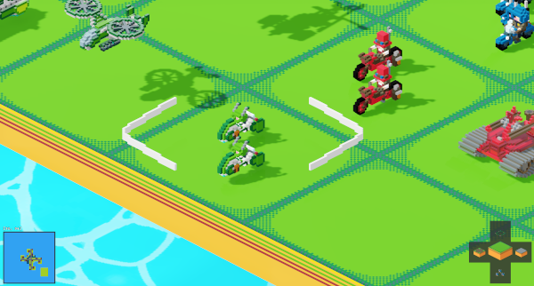
I guess I forgot to take make progress artifacts for green Infantry, Tank and Helicopter, but these will be visible later. Here we have a Hoverbike for Mobile Infantry.
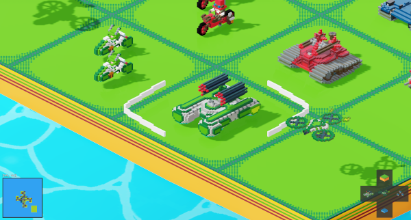
And a Hovertank Rocket Artillery, with a Scout Tricopter drone.
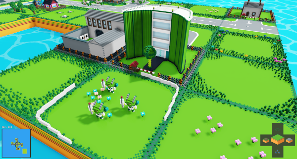
Green HQ is a big administration building, with a Grasshopper Infantry!
Futuristic Barracks building.
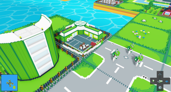
And a Futuristic Factory, this time with a Hovertank being assembled, and a deployed one in front of it.
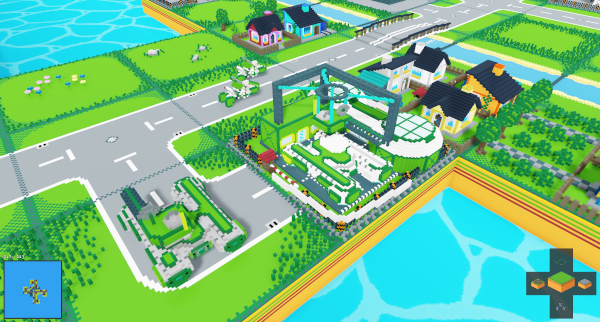
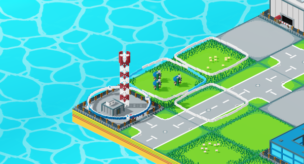
Green Airfield is a big tower with a landing pad, and some storage area underneath.
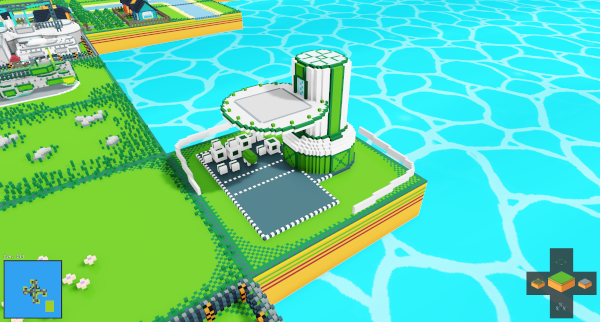
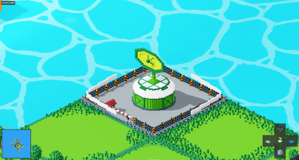
Radar Station serving as a Tower for green nation.
Good! Now take a breath, and keep going!
Yellow nation style is medieval/feudal. Their infantry consists of Feudal Knights armed with crossbows and a small cannon.
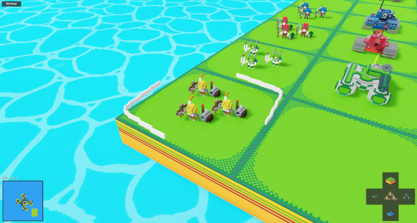
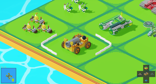
Keeping in theme, the Tank is a mobile Outpost with a huge cannon!
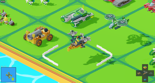
Helicopter is a re-purposed boat with propellers, equipped with a crossbow and some bombs.
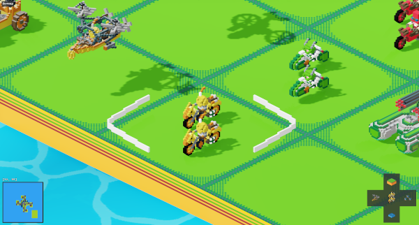
Mobile Infantry is riding Horse Motorbikes! I hope Nintendo does not sue me for stealing their idea from Mariokart Link!
Rocket Artillery uses the same Mobile Outpost frame as the Tank, but this time it is a huge ballista, that shoots rockets. Because that makes sense.
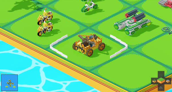
Feudal Scout has been built according to plans made by DaVinci himself. It is armed with two small crossbows, just in case.
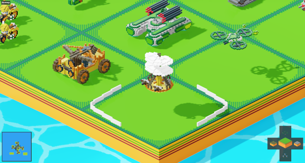
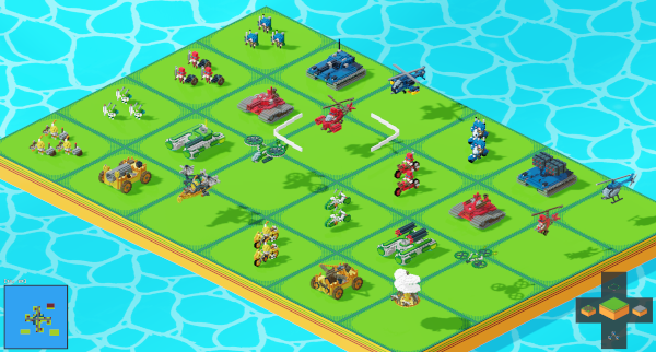
All units for all nations are now complete. At least for now, as I will probably revise them later. In the meantime, enjoy the full set.
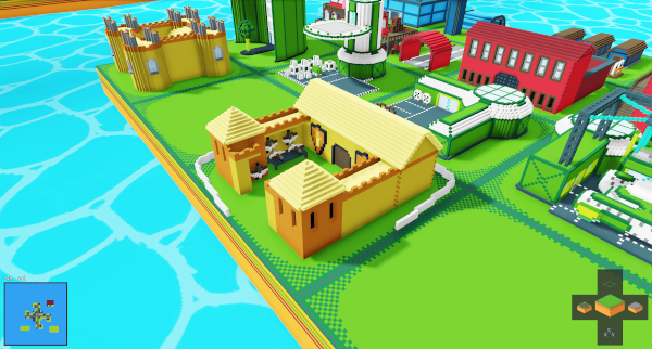
We still need some Feudal buildings. It is only fitting for the HQ to be a castle, which we can see in the background. In front we can see Feudal Barracks, decorated with some shields.
Feudal heavy units have huge parts that are cast in this Feudal Forge.
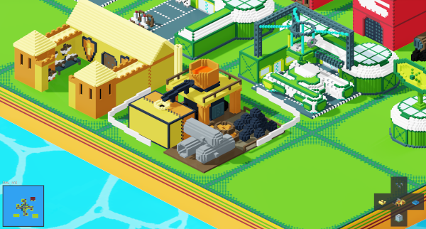
Airships are built in the Airshipwright Construction Yard
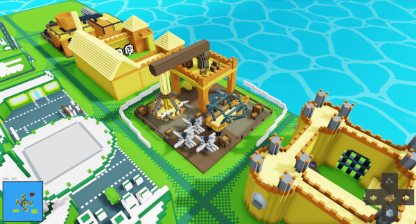
Feudal Tower is literally a tower. It came out a bit small though, so I want to re-do it later. Maybe a Wizard lives there?
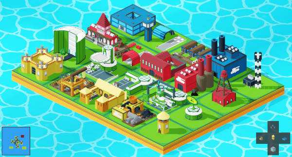
All buildings are ready, and present nicely in that set screenshot.
That was a lot of very good progress, and I am motivated to go on. Trello board looks a bit intimidating, but I believe, step by step, I can do it.
I have looked at my commit history on Github and could not believe that ToF repository is 2 years old! Serious work started about a year ago. I guess I have to focus more.
